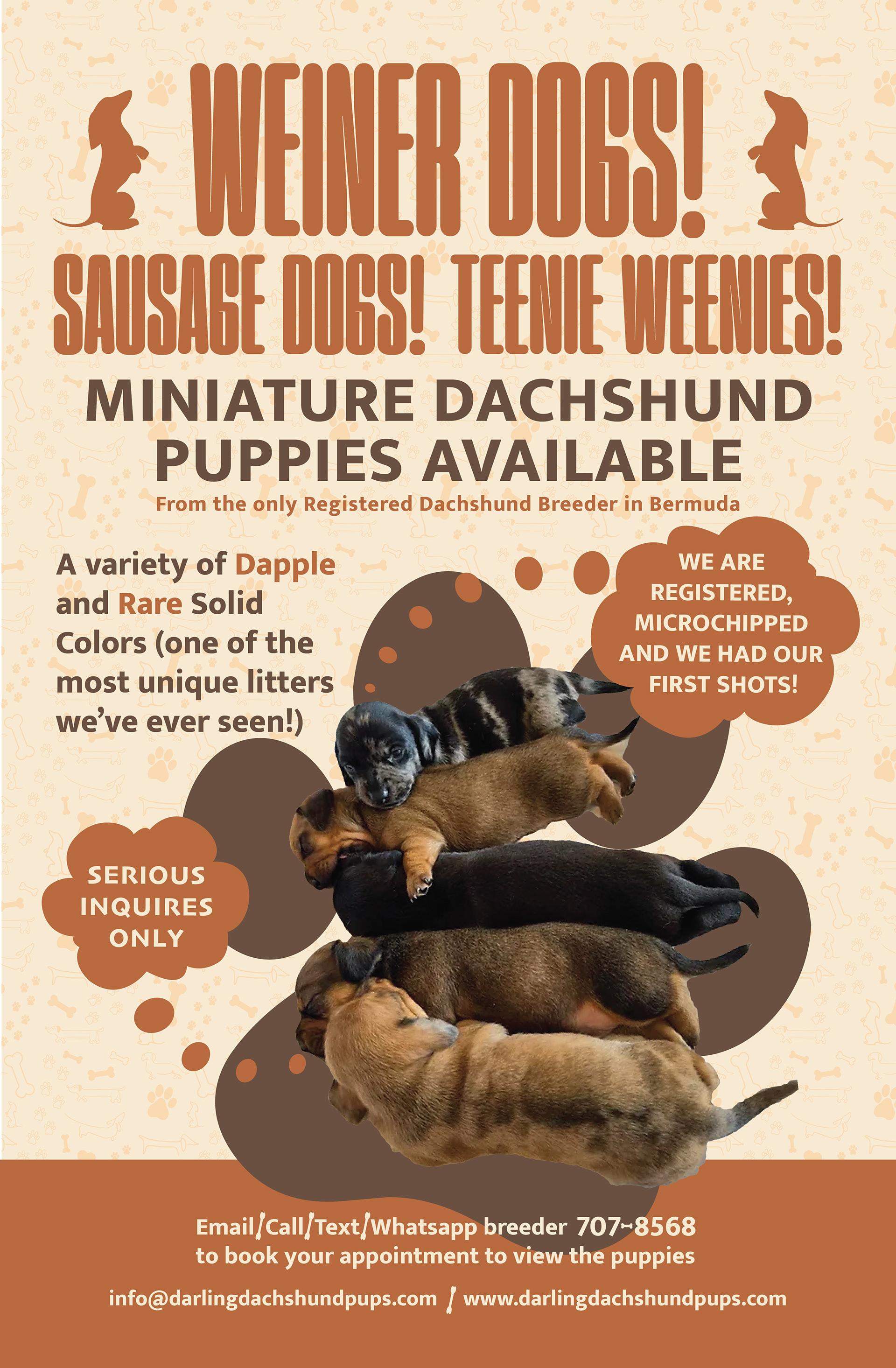

Client: Katherine Good
Project: 2024
poster layout design
Katherine needed posters quickly to advertise her new litter for sale. I was provided images and copy. I was give the task to make an engaging, fun poster but not childish. This is why I chose the colour pallet; the orange is bright and fun. The aqua color compliments the orange. While the brown and burnt orange is a more subdue and sophisticated color pallet. The poster is text heavy, and is important information that needed to be included. That is why I used the thought bubbles coming from the puppies to make it look less cluttered and more comical and cute.
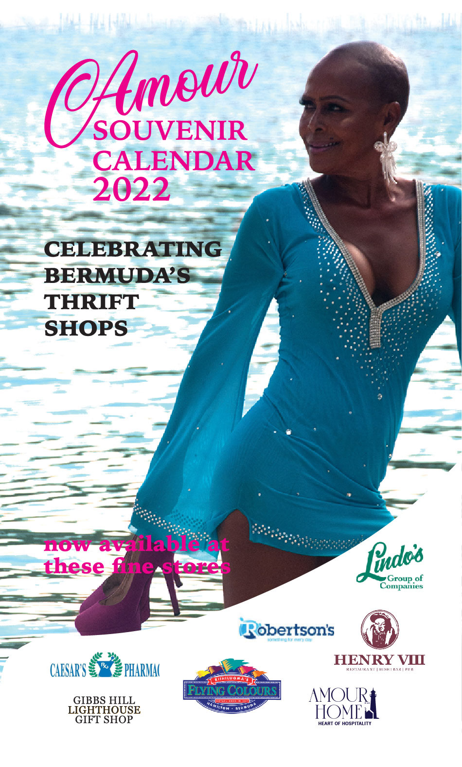
Client: Claudette Baisden
Project: 2022
newspaper flyer ad
This was an ad created to promote the sale of Ms Baisden's 2022 calendar. This was before her rebrand. we opted to just use her wordmark at the time. Image selected was to show off the thrifted clothes as well as the Bermudian scenery.


Client: Erika Van Putten (an event coordinator in NY)
Project: 2020 and 2021
flyer design
This was my first time doing paid designs outside of Bermuda. The client gave me design control. All I had to work with were a few adjectives of what she wanted the design to portray (and the information copy). I think I captured the spooky and sexy in the halloween flyers and calm and relaxing in the spa day event flyers.
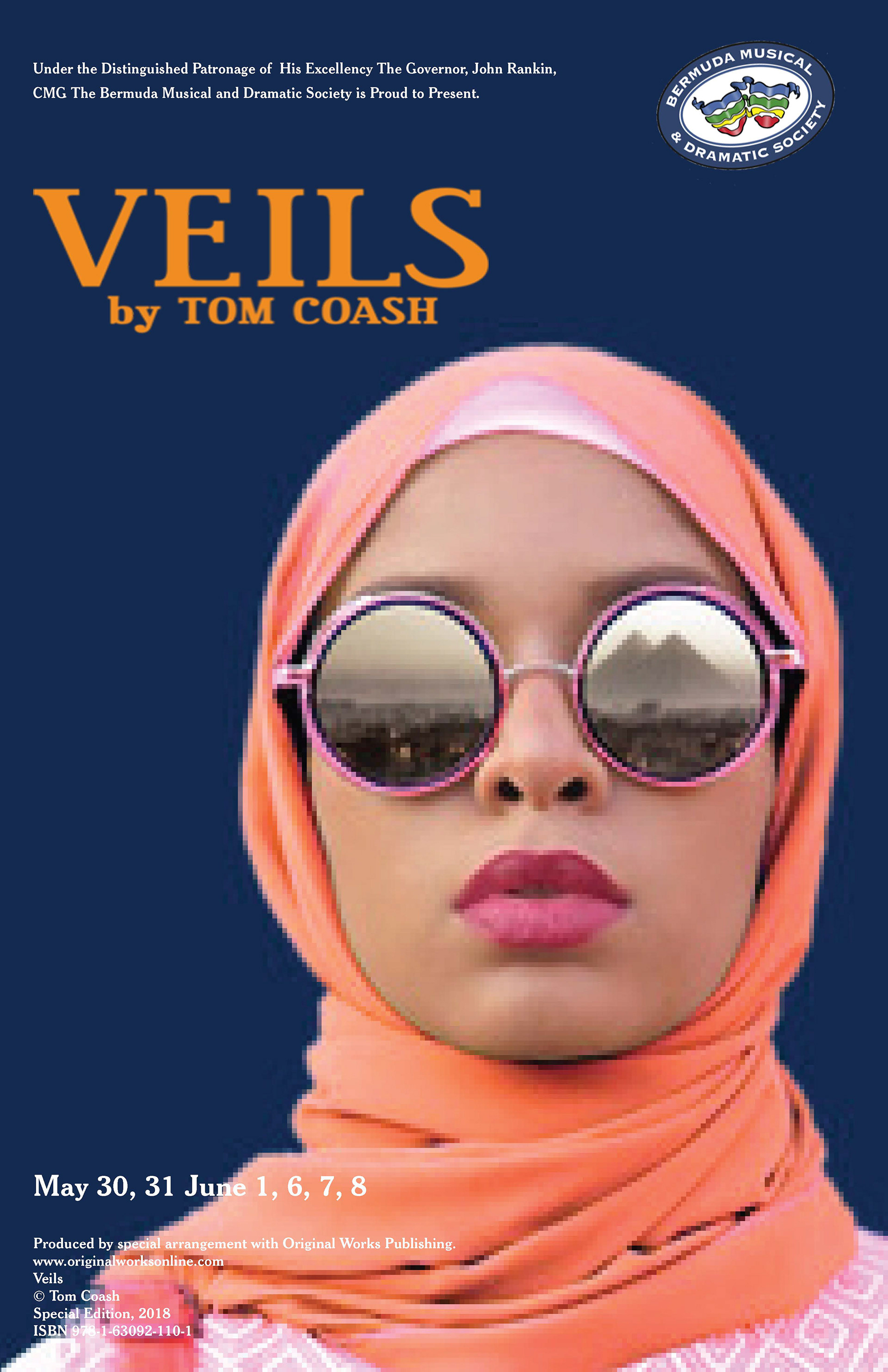
Client: BMDS (volunteer work)
Project: 2019
poster layout design
Requested a simple and impactful poster. (images provided by BMDS). I was responsible for the layout.
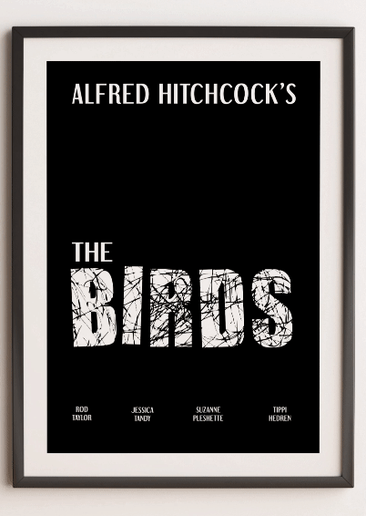
Client: N/A
class project
Project: 2017
type poster design
Design requirements were to create a design that conveyed an emotion/feeling only using typography. I chose to recreate some of Alfred Hitchcock movie posters. With the Vertigo movie poster I wanted it as minimal as possible while convey the feeling that the main character felt throughout the movie. That is why I created a text effect so the title of the movie looks extremely blurry.
The text effect I used on the movie poster The Birds was representative of the birds scratches, and the splattered blood they caused after their attacks.
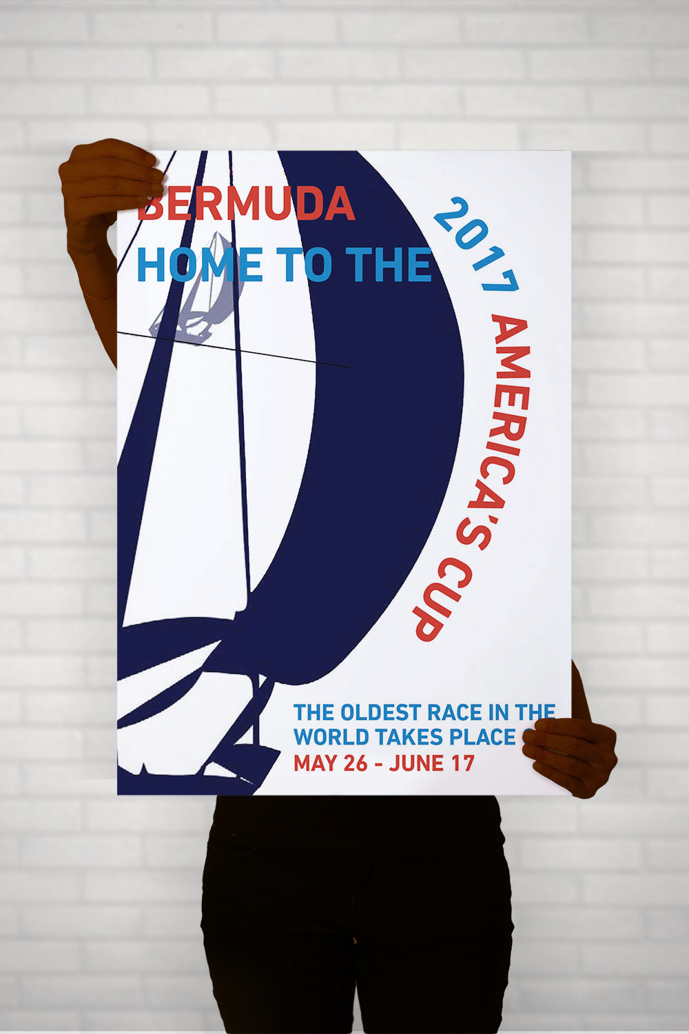
Client: N/A
class project
Project: 2016
poster design
This was project requirements were to design a poster(s) that advertised a real life event. I chose to do design a poster promoting the America's Cup because it was be discussed a lot and it was important to Bermuda. The colors I chose represents the US flag as well as Bermuda's Blue waters.
Client: N/A
class project and client(s)
Project: 2018 - 2022
banner design
collection of banners I designed for a project, a website and for cup match